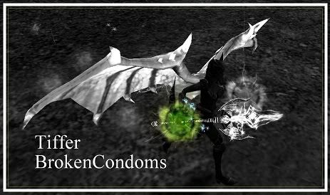
Being the non artist that I am, Im looking for opinions on this new sig I made. Comments on balance, design, over all layouts, coloring are all much appreciated.
Thanks.

This is a discussion on New Sig within the Media forums, part of the Knight Online (ko4life.com) category; Being the non artist that I am, Im looking for opinions on this new sig I made. Comments on balance, ...
Page: 1
 LinkBack URL
 About LinkBacks
Being the non artist that I am, Im looking for opinions on this new sig I made. Comments on balance, design, over all layouts, coloring are all much appreciated.
Thanks.
Black and white is boring :/ you need colors!! Text doesnt really fit. and the 1 green pathos looks weird lol.
2/10 cause i like the boarder xD
need a better font
border sucks
dragon wings are dull... just remove them
body was too dark, on top of it we got the bright dragon wings... it seems as if you were trying to focus your sig on the wings lol (based on how its centered on them, too).
i can see ko's grass
green pathos? is that a hidden message to the opposite nation rogues?
other than that its okay lol, im no sig expert but thats my input
kinda big too..
+1 for the border then I guess.
And ya, human rogues had better watch their asses. Just sayin.
Allrighty. I'll rework it with color and such. Sadly all I have to work with is paint and Picasa, which is what I made this in, meaning my possibilities are limited.
I'm going to have to say 3/10. Lack of colour, you could use the colour as a focal point in the image, to draw someone's eye, and just 1 of your pathos just isn't doing it right.
Maybe the whole chaotic staff and the wings should be coloured and the rest black and white. That's my silly opinion.
What for program can you use for make signatures of ko ?
Photoshop or another programs are better ?
photoshop is the best
If it's your first sig good job keep up the good work , you will get better at it and gain more skills at adding more effects most cant even make a sig so gg.
 Posting Permissions


 Reply With Quote
Bookmarks