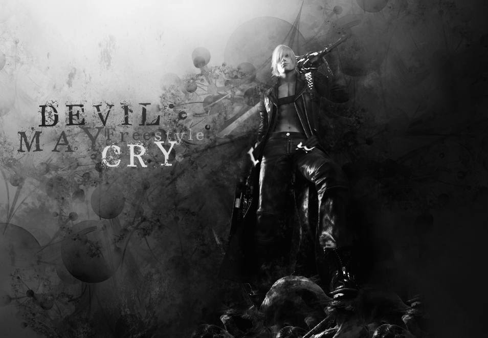
Page 1 of 2 12 LastLast
Results 1 to 15 of 17

Devil May Cry (LP)

This is a discussion on Devil May Cry (LP) within the Graphics forums, part of the Off Topic category; in black and white...
Page: 1


  1. #1
    Senior Member
    Join Date
    Jan 2007
    Posts
    375

    Default


    in black and white


  2. #2
    J
    J is offline
    Senior Member J's Avatar
    Join Date
    Sep 2006
    Location
    It's hot here
    Posts
    3,029

    Default

    Damn. I like your current sig also.

  3. #3
    Senior Member Bountyhunters113's Avatar
    Join Date
    Dec 2006
    Location
    Chicago
    Posts
    357

    Default

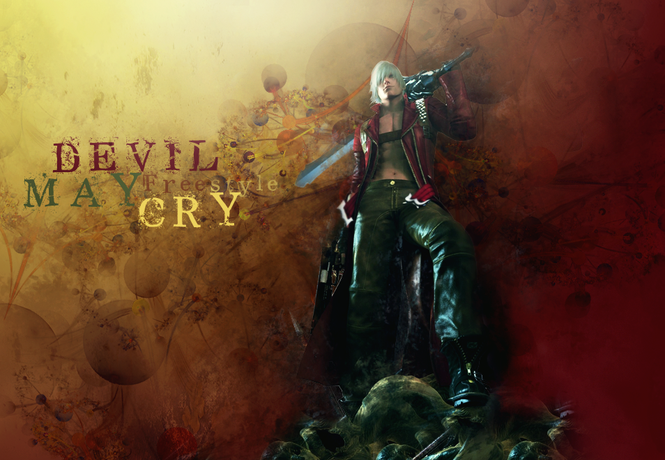
    the green color on the word "may" just killed it

  4. #4
    aka Manipulation Senior Member KungPaoChicken's Avatar
    Join Date
    Jan 2007
    Posts
    1,702

    Default

    yeah the green is sorta an off color

  5. #5
    killa
    Guest

    Default

    i like it, i think theres a little excecive brushing at the leg area but its nice,realy clean good work ammock

  6. #6
    Senior Member
    Join Date
    Dec 2007
    Posts
    1,240

    Default

    yeah the green is sorta an off color[/b]
    I think it works. It kinda matches with the colour of the pants + platform that the dudes standing on.

  7. #7
    StoneColdAngel
    Guest

    Default

    Damn I :wub: the first. Perfect color chose and even the font is well done. Might I use it?

  8. #8
    Lord0fWar
    Guest

    Default

    lighting is really nice. I'd say its perfect wouldnt change a thing =)

  9. #9
    Senior Member
    Join Date
    Jan 2007
    Posts
    375

    Default

    Damn I :wub: the first. Perfect color chose and even the font is well done. Might I use it?[/b]
    sure if u want to
    ty for comments every one

  10. #10
    StoneColdAngel
    Guest

    Default

    sure if u want to
    ty for comments every one[/b]
    Thanks a lot ^^

  11. #11
    paperownz
    Guest

    Default

    Very Nice job.

  12. #12
    Banned
    Join Date
    Jul 2006
    Location
    Estonia
    Posts
    2,340

    Default

    Wow this is amazing But isn't the size abit out of the wallpaper size?

  13. #13
    Senior Member
    Join Date
    Jan 2007
    Posts
    375

    Default

    Wow this is amazing But isn't the size abit out of the wallpaper size?[/b]
    yehh
    but it wasnt meant to be a wallpaper

  14. #14
    lil_mageskillz
    Guest

    Default

    thats looks ncie gj

  15. #15
    imma cut you up Senior Member lIIIIIIIIIIl's Avatar
    Join Date
    May 2006
    Location
    United States of Eurasia
    Posts
    3,226

    Default

    blending sucks. text sucks. but overall its one of the rare occurances of art that i actually not "hate" on ko4life.

Page 1 of 2 12 LastLast

Bookmarks

Posting Permissions

  • You may not post new threads
  • You may not post replies
  • You may not post attachments
  • You may not edit your posts
  •