Latest sig:
Rates N' Comments pls

This is a discussion on Fire Wizz within the Graphics forums, part of the Off Topic category; Latest sig:
Rates N' Comments pls...
Page: 1
 LinkBack URL
 About LinkBacks
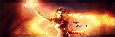
Latest sig:
Rates N' Comments pls
Hmm. i dont liek it, but i dont no why :S
I dont like the text much maybe.. seriously dont know ^^
Improving it
Alright, done. Sig is posted
Rates N' Coments ^_^
looks pretty nice blended into the background :P
can i see the render plx?
You blended it well altough that render is not a good choice. Another thing is that you dont use not sure atm wich key it is but while you transform the size of the render you press alt or ctrl while u increment or decrease the size of the render. Why would u do that? cuz ur render looks like u changed the shape of it while u decreased the size yo.
The font..looks gay with that sig.
Agreed.The font..looks gay with that sig.[/b]
Render too Small?
Went through lots of Fonts and this one seemed to fit nicely. And NecrosS resized the render, so I don't know what key he used JC
in transform hold Shift down, then u wont miss-size (or how ever ud call it :P) the render... anyway, after seeing the render, im not THAT impressed, a sig like that can be done pretty easy =/ a bit smudging, gradient maps, and some brushes, and thats about it id say
Yea I was basically trying out Gradient Maps and Blending Optionsin transform hold Shift down, then u wont miss-size (or how ever ud call it :P) the render... anyway, after seeing the render, im not THAT impressed, a sig like that can be done pretty easy =/ a bit smudging, gradient maps, and some brushes, and thats about it id say[/b]
ah :P then i wasnt that wrong, u havent done alot to the "background" of the sig right? just brushes some black, smudged a bit perhaps, and changed colours, and made the flamish thingys a bit "bigger" u could say :P
Exactly, and you weren't wrongah :P then i wasnt that wrong, u havent done alot to the "background" of the sig right? just brushes some black, smudged a bit perhaps, and changed colours, and made the flamish thingys a bit "bigger" u could say :P[/b]
I had a problem with previous sigs, that whenever I used Gradient Maps I couldn't make them look good with some of the Blending Options, so basically I added tons of maps, changed colors, blending options, smudged a bit and made the flame more intense
 Posting Permissions


 Reply With Quote
Bookmarks