adds alot better atmosphere and depth

This is a discussion on His Dark Portrait within the Graphics forums, part of the Off Topic category; adds alot better atmosphere and depth...
Page: 2
 LinkBack URL
 About LinkBacks
adds alot better atmosphere and depth
Added spider + cracks. Changed saturation and lighting on frame, background's lighter to the left of the reaper. Bit of a reddish tinge on the left side and darker on the right. Text not changed too much because I stuffed it up doing applied images >.<[/b][/quote]Hmm how about this?
<div align="center">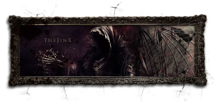
wowie, thats creepie but very good imo :P. and i think that text looks just fine.

Added spider + cracks. Changed saturation and lighting on frame, background's lighter to the left of the reaper. Bit of a reddish tinge on the left side and darker on the right. Text not changed too much because I stuffed it up doing applied images >.<[/b][/quote]Hmm how about this?
<div align="center">
Much better
 Posting Permissions

 Reply With Quote

Bookmarks