like 1st but the last 1 is really meh <_<

This is a discussion on 4tags within the Graphics forums, part of the Off Topic category; like 1st but the last 1 is really meh <_<...
Page: 1
 LinkBack URL
 About LinkBacks
like 1st but the last 1 is really meh <_<

I like the 2nd one :P
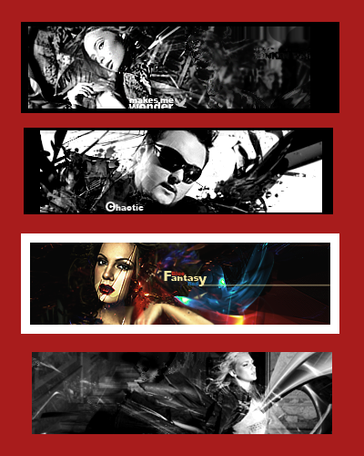
Bro, don't ever make a white border like that (3rd Sig) Looks ugly ^_^
thx for comment
border is there to make u see some things u normally wouldn't see or
to make something less visible,black border didn't fit it so white did,it's there for
purpose
I try to make MY things,going as much wierd as I can,doing things u wouldn't do
so that's it,again thx for comment
Even tough i like black/white i love colors, i love to play with them on photoshop and i think that w/o them life wouldnt be as beautiful as it is. That goes for sigs also, there so many color combinations u can make to make ur sigs look awesome, try em out.
In my opinion the 1st sig would look better with color. The font should be placed elsewhere
The 2nd sig looks good in black and white the only bad thing i see is that the font looks blurry
In the 3rd sig the*border*is*way*too*big*that*it*makes*it*look*ba d,*try*a*5*cm*white*border*instead*of*that*one,*al so*the*face*of*the*girl*looks*kinda*weird*
and the 4th one i dont really like that one
1- I made it in color first few layers but colors weren't getting along TRUST ME...I also askedIn my opinion the 1st sig would look better with color. The font should be placed elsewhere
The 2nd sig looks good in black and white the only bad thing i see is that the font looks blurry[/b]
friend before I posted it,he said that sig in color-CRAP
there's also possibility to color it myself,but I'm too lazy for that :P
about font,no it wouldn't look better somewhere else,this is the only place where it's near focal
and it doesn't take too much attention off of focal... also it's not usual place and combination so it
makes it even more of my taste
2- it's not blurry opacity is just lowered
thx
1- I still dont like how it is placed and cutted by the border, it could look better.
2-*font looks blurry.
Np
It's ur right to have ur own opinion and I can't tell ur wrong,I just tried
to explain why I did it like I did :P
If the color was bad u can always recur to using gradients baba and u know ittttttttt
P.s: fu
The 1st and the 2nd is nice.. Good job.
 Posting Permissions

 Reply With Quote

Bookmarks