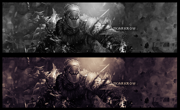
Black and white, or with a gradient (perhaps too much..)?

This is a discussion on Which one's better.. within the Graphics forums, part of the Off Topic category; Black and white, or with a gradient (perhaps too much..)?...
Page: 1
 LinkBack URL
 About LinkBacks
Black and white, or with a gradient (perhaps too much..)?

I like the second one better =]
with gradient id say
I like the second one better =][/b]
Yea with gradien't maps for sure
don't use black and white on ko sigs :P
Greetz
second one if you make the lightsource more powerfull...just make it whiter at the top.. also blur the parts that aren't involved with the focal a bit more..
2nd one, and as cruX said make the light source brighter
Erase the gradient over the render so that the sig isn't 1 coloured
i like ivery much the second one.
Thanks guys I'll keep that stuff in mind ^_^
Third version added:

I like the 2nd one
good work
Third one, and if you're a perfectionis the border is bigger on the rite than on the left :lol: :P (On the third one, ofc)
It's also one pixel too high xD *gasps and shoots self*Third one, and if you're a perfectionis the border is bigger on the rite than on the left :lol: :P (On the third one, ofc)[/b]
 Posting Permissions

 Reply With Quote

Bookmarks