ye this would have been my sotw entry :P would like to hear how ppl like it


This is a discussion on rate within the Graphics forums, part of the Off Topic category; ye this would have been my sotw entry :P would like to hear how ppl like it...
Page: 1
 LinkBack URL
 About LinkBacks
ye this would have been my sotw entry :P would like to hear how ppl like it
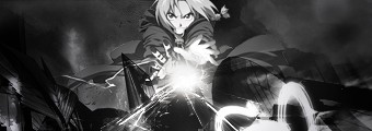
Pretty nice....but of course u know that much hehe
Already commented on it on MSN.
Pretty good one
nu i wanna hear critic
I think it lacks a bit of deph and I would of chose another colors for the BG to make it blend more with the render. Text is alright.
I like it. Can't really say anything bad about it, tbh.
Nice, Diff bg color will look nice.
I don't like the bricks and the lightsource seems to be coming from nothing? Just add a bit more detail around the lightsource so I can tell what it is
i think its jsut a random light crux
Like Canz said, the background colors don't blend so well with the render. Otherwise pretty good.
the light source is the shiny ball something in her hand i brush at it a bit so its not so good to see
and if u mean the mosaic thing by bricks i just used it to try out and i myself like them but thats just
personal taste of art^^ anyway thx all for comment mby gonna try and change bg later today
well i really cant pick it apart, i myself find the contrast between the mosaic and the render/lightsource is scrumptious lol...but thats just me. I also like right above the light, how u added the glow on the mosaic..its all good for me but were all different i suppose.
I just don't like it for the simple fact that it's random and doesn't seem very realistic to be behind the render :P If you're going to do lightsources from the hand, make sure that the hands are still visiblethe light source is the shiny ball something in her hand i brush at it a bit so its not so good to see
and if u mean the mosaic thing by bricks i just used it to try out and i myself like them but thats just
personal taste of art^^ anyway thx all for comment mby gonna try and change bg later today[/b]
hands are visible :P just look better
I loved that render, I was always too afraid to touch it though! The light's coming from a floating orb isn't it? and the hand is below that light, if I'm remembering the render right..
Doesn't seem to fit with the background, colorwise. I like the effects used, so perhaps with some change in coloring it would be great!
 Posting Permissions


 Reply With Quote
Bookmarks