well, just an overview, i havent really made a siggy in a LONG time
finally got PS again [CS4 cracked ftw]
so i made these today
all feedback is welcome

This is a discussion on Rate? :) within the Graphics forums, part of the Off Topic category; well, just an overview, i havent really made a siggy in a LONG time
finally got PS again [CS4 cracked ...
Page: 1
 LinkBack URL
 About LinkBacks
well, just an overview, i havent really made a siggy in a LONG time
finally got PS again [CS4 cracked ftw]
so i made these today
all feedback is welcome
Last edited by abdeucethree; 09-03-2009 at 04:12 AM.
6-10 nothing much to see here
oh Alex Da Deuce 3
made mine
decent job could be better
any one? xD

i like it man :P
colors stand out very nice
Better than me...
thanksOriginally Posted by volcompat

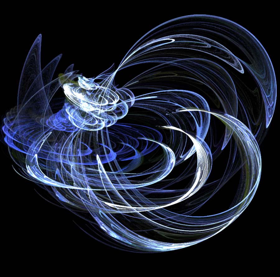
first one, main pic was originally black and white so i went with that theme
PS. added 3rd sig made today
are u using brushes or C4D's maybe u know them by Renders.
erm, idk what you mean when you say C4D's
and yeah, i use brushes, i dled a couple sets from websites [ CS4 V2 Light Effect Brushes | Qbrushes - Photoshop Brushes ] for example also some splatter, and grunge ones etc
i make all my backgrounds with a 2 colored paint bucket + filters, and maybe a big grunge brush if i feel like it ^^
C4Ds are 3D/4D effects used as an element of background, but they look ghey 90% of time...
CS 4 sucks ^^ CS 2 ftw
about your sigs:
1st one is a bit empty at the left side... try cuting it a bit
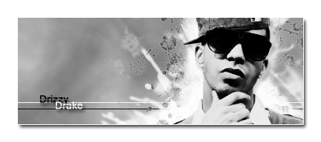
2nd - that green is just bad
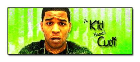
3rd - that shadow/outerglow looks bad... especially on his right hand - it's cut at the top... it should be smaller at the text and completely removed from the hand. since he doesn't have it at his other hand, or it's just unnoticeable, it would make sense if you completely removed it from hands
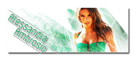
4th - like this one the most :P it's simple and very nice
also you could move the text a bit closer to her and cut the sig a bit :P
edit:
here are 2 C4Ds I've just googled :P
yeah, i dont like to use those
i did when i started making sigs a while back, then just stopped
didnt know thats what they were called xD
i like to use 350x150 or 400x150 for my dimensions, idk i feel more comfortable doing it that way. and i usually have like a empty 25pixel border around the entire image especially when i have things hanging off the sig [like the manny one, but as you can see i messed up with the drop shadow on his hand ^^]
and i like to use bright bright colors, as you can seemainly because everyone elses are mostly dark, which i dont really like all that much
but thanks for the feedback, ill keep it in mind for my next sigs
neither do Iyou need very fitty C4D to make the sig look nice with it...
you can make it how you want it... cut it after you're done with everything - Edit -> Canvas Size
i edited and re uploaded the manny one
i mean, i start with the base of 400x150
paint bucket + filters/burshes then paste my cut pic onto it
brush filter layer etc etc etc
then once im done with everything i add 25px to all sides, cut anything outside the 400x150 box, merge all layers add a 1px black or white "stroke" to it and a drop shadow
[the extra 25px around helps make the drop shadow visible.
I know it :P I'm just saying that you can cut the empty part from the sigs with few clicks :P
also, the Manny one looks the same as b4?
removed the drop shadow from his left hand is all
press f5 if it didnt refresh
Nothing really special nice colours maybe but thats about it
 Posting Permissions


 Reply With Quote


Bookmarks