Tell me what you think..advice would be appriciated
1.
2.
3.
4.
There not that great I know, Im more looking for advice.

This is a discussion on Rate it? within the Graphics forums, part of the Off Topic category; Tell me what you think..advice would be appriciated
1.
2.
3.
4.
There not that great I know, Im more ...
Page: 1
 LinkBack URL
 About LinkBacks
Tell me what you think..advice would be appriciated
1.
2.
3.
4.
There not that great I know, Im more looking for advice.
bumpno one likes them
i did like them, its just that i didnt have much to sayh34r:
i really liked the second one, but you cant see the render very well , im still not sure what it is xD
three looks really cool (no pun intended :P )
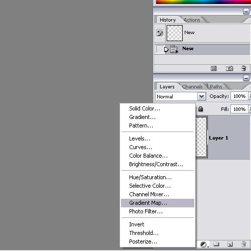
one kinda looks odd :unsure: doesnt look pg-13 but im not sure lol, also i dont think the background fits the renders too well, and they stick out a bit. so maybe try brushing over them a little and/or doing that gradient map thing cava told me about.
the brushing on the render of four looks a bit excessive, it doesnt really blend it in anyways but it just like distorts it. i do most of my brushing around the edges of the image, maybe you can try that? also blur and/or smudge the outermost edges a bit (where the render meets the background). also theres this weird rectangle thing down the center of the sig :huh:
and go rate/comment my samurai one :P
lol I'll write something up for yours in a minute, But thanks for the time. as for my sigs, Let's see.. Number 1. I kinda agree they stand out a little, and I think it is pg-13 cause they still have there clothes on :Pi did like them, its just that i didnt have much to say
i really liked the second one, but you cant see the render very well , im still not sure what it is xD
three looks really cool (no pun intended :P )
one kinda looks odd :unsure: doesnt look pg-13 but im not sure lol, also i dont think the background fits the renders too well, and they stick out a bit. so maybe try brushing over them a little and/or doing that gradient map thing cava told me about.
the brushing on the render of four looks a bit excessive, it doesnt really blend it in anyways but it just like distorts it. i do most of my brushing around the edges of the image, maybe you can try that? also blur and/or smudge the outermost edges a bit (where the render meets the background). also theres this weird rectangle thing down the center of the sig :huh:
and go rate/comment my samurai one :P[/b]
2. It's a dude with a sword, and as for the Render..That purple stuff is the render :P (for the most part)
3. isn't too bad I think.
and that square was a eraser mark I left by accident XD
and can you explain that gradient map thing to me.. I don't know what it is
it blends the colors to fit the gradient pattern a bit, so you can use it either to balance the colors or to change the look of the sig, or both :P. just lower the fill and/or opacity of the gradient layer so that it doesnt completely cover the sig :P .
sweet thanks
oh and don't forget the one I just made..it's in my sig.
that one kicks ass
although the text is kinda hard to read :P
 Posting Permissions


 Reply With Quote

Bookmarks