new sig nothing speacial but kinda like it so rate pls

This is a discussion on Rate and comment pls within the Graphics forums, part of the Off Topic category; new sig nothing speacial but kinda like it so rate pls...
Page: 1
 LinkBack URL
 About LinkBacks
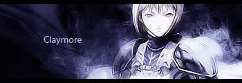
new sig nothing speacial but kinda like it so rate pls
I don't like the text but other than that, good job
gots a nice flow :P i like it, and as canz said, fix the text :P
and wooooooooooooh claymore <3
Clare pwns <3have u watched the entire anime yet? ^_^
sure thats why i made the sig :P
Jebus. You don't like any font.
not its kinda funny first ppl say use standart font now they yell at me cause i do >.<
it's not about which font u use,it's about how u use itnot its kinda funny first ppl say use standart font now they yell at me cause i do >.<[/b]
here is the sig without text would like to see how u would to suggest to put text on it

just leave it without text?
heres a quick font change, + i added some detph to it:
:P
Lol, its not about using Standard Fonts or not, NecrosS.
Look, you have to place the font correctly, and you have to CHOOSE the font correctly. You asked for rates and comments, its good you used a standard font but that one wasn't even close to look good with that signature.
As for Wind's sig, I think it steals a lot of attention from the focal, but thats just me. I'd take the sword out, the text looks amazing that way.
u might be right about that canz ^_^! XD
alot of ppl on ko4life seem to do the 2 thick black lines, 1 at top and 1 at bottom... wat kind of border is this? :blink: G4Y3D
i like the sig itself and its probably better den wat i culd do but yea needs a better border and text. I giv it a 7, good job
Kiwi its a pretty much "standard border" u can make it if u make a new layer, and click Apply Image, under Image Settings, and then u can go to Image/File (cant remember which one it is :P) and then u can click Stroke, and choose how many pixels u want it on, that way itll draw a black square at the edges of your sig, then u can delete some of it, and ull have 2 black lines etc
 Posting Permissions


 Reply With Quote
Bookmarks