rate it pls and give comment
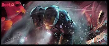
this a diff version
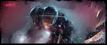

This is a discussion on Rate my iron man sig pls within the Graphics forums, part of the Off Topic category; rate it pls and give comment
this a diff version...
Page: 1
 LinkBack URL
 About LinkBacks
rate it pls and give comment
this a diff version
The 1st is really nice but the lightning in it need a quite alot of work. Suggest you that you take out the paint bucket and paint a new layer with black and put the layer to overlay 20% then bursh some white to the spots where you want the light to be at.
okThe 1st is really nice but the lightning in it need a quite alot of work. Suggest you that you take out the paint bucket and paint a new layer with black and put the layer to overlay 20% then bursh some with to the spots where you want the light to be at.[/b]

Wow great job the the first 1
the 1st one is better. great job.
one thing i don't like is that down right corner where you have the colored dots. would look good without them :P
ill post it to show you guys anywaythe 1st one is better. great job.
one thing i don't like is that down right corner where you have the colored dots. would look good without them :P[/b]
hope you like it
for ferruzo? xD
what ya mean i posted the one with out the spallter for boutnyhunterfor ferruzo? xD[/b]
if you emphasize more light on his chest and hand it would look nice. it's a good sig but nothing else, just good.
may i ask how would i do the light?if you emphasize more light on his chest and hand it would look nice. it's a good sig but nothing else, just good.[/b]
rings any bells?The 1st is really nice but the lightning in it need a quite alot of work. Suggest you that you take out the paint bucket and paint a new layer with black and put the layer to overlay 20% then bursh some white to the spots where you want the light to be at.[/b]
i did the darker thingy

better imo, just need to trim down some of the lightning like the area inbetween the hand and the chest (the middle of that) kinda along the arm shouldnt have that much light imo.
but still way way way better than anything i can do 9.5/10
okebetter imo, just need to trim down some of the lightning like the area inbetween the hand and the chest (the middle of that) kinda along the arm shouldnt have that much light imo.
but still way way way better than anything i can do 9.5/10[/b]
 Posting Permissions

 Reply With Quote


Bookmarks