1
2
3

This is a discussion on Rate my sigs within the Graphics forums, part of the Off Topic category; 1
2
3...
Page: 1
 LinkBack URL
 About LinkBacks
1
2
3
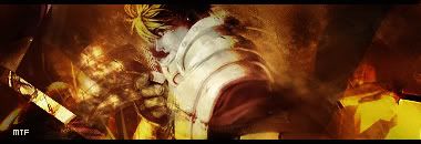
1-oversharpen render, empty right side, dont like those color burn colors and i really ant find sence of that clipping mask
2-from those definitelly the best but again the right side is really empty and i think that lighting is bad you have it left side top of siganture but the render is made to get light from right middle from back (check shadows on weapon and check shining on left shoulder of soldier)
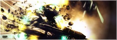
3- is the worst one from my point of view, dont like the way you tried to blend it and that space art on the background isnt really nice (maybe alone but you put c4d and waved it or something like that with kind of strange blur)
everywhere work on typo, for example the second sig should have the typo on the right side where its kinda empty and it would look good
read tuts and check some1 elses work cuz i can see from your previous sig and also from those ones that you dont have the feeling for colors
this is what i think about them
GL in next work
2nd 1 is the best,and its cool,only that right side is lil empty
#3 dont like the background
#1 dont like anything on it :P
the third is my favorite lol, i like the background, depth and coloring and lighting. then the second. dont really like the first--the color on the guy is pretty bad imo.
 Posting Permissions

 Reply With Quote

Bookmarks