k , its right down there u can look at it , just a tribute to my ares chars
i wanted something very saturated and kinda oldish misterious theme... i think i got it , and oh yeah its my first sig :P

This is a discussion on first sig :) within the Graphics forums, part of the Off Topic category; k , its right down there u can look at it , just a tribute to my ares chars
i ...
Page: 1
 LinkBack URL
 About LinkBacks
k , its right down there u can look at it , just a tribute to my ares chars
i wanted something very saturated and kinda oldish misterious theme... i think i got it , and oh yeah its my first sig :P
5/10 for me
ah , can u tell me what do i have to improve? remember i said its my first sig
some tips would be usefull

its not bad for first sig but u should keep the render visible i mean so u can see them clearly just make i lil bit transparen the font is too simpel and i would make it lil bit darker if u could send me the psd file i could probably help u a lil bit more
it's not bad..I think there is too much stuff.. and as said..keep the render visible.. and try and blend your text a bit,
I would say 5/10..giving you the doubt that your a first timer.
ah , how can i make better text , anyone know a good site with guides for that?
dafont.com
what they said, and you can also try messing with the lighting effects (filter-render-lighting). and go over the topics that say something like "ratings plz" since people usually comment, so you can probably find useful tips there. and tutorials help too :P
i made a new siggy , old one was noobish xD , second sig ftw .. what about this one ? :P hope its better
yeah its better
- outerglow of the render
colors
background is put away from render
absolutely no depth
+ really better then first one
for second sig it looks good
typo looks really cool
what do u mean with " background is put away from render "h34r: and no depth? dont really get that part
and i suppose color its all about personal taste
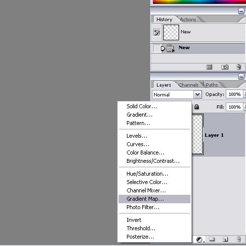
i think what he meant by the background thing is that you didnt blend the render into the background, so it just looks like you made the bg and then pasted the render on it (which i'm guessing is just what you did :lol: ). you need to blend the render by brushing over it, particularly the edges. i'm still having trouble with the depth thing, from what i understand it involves messing with the lighting to create shadows and messing with blurs to create a focus point, so it looks like the sig could be a real life image. and the colors i think he meant that the colors dont look blended, try doing a gradient map over the image when you're done, and/or over background/anything else you think could use it (low opacity and/or lower fill, if not it just covers your image lol, so play with the two until you like what you see, though usually i find just lowering the fill looks better) (see below)
you can choose the colors you like and the style, but you should still try to blend them a bit (not make everything the same color, but just make them more similar)
it blends the colors to fit the gradient pattern a bit, so you can use it either to balance the colors or to change the look of the sig, or both :P. just lower the fill and/or opacity of the gradient layer so that it doesnt completely cover the sig :P .[/b]
so try again :P
+1 and the gree color doest really fit in the sigg
its your second sigg so read tuts and show us your next one
 Posting Permissions

 Reply With Quote

Bookmarks