1
2
3
4
5
ratings /10 and comments plz ^_^

This is a discussion on ratings plz within the Graphics forums, part of the Off Topic category; 1
2
3
4
5
ratings /10 and comments plz ^_^...
Page: 1
 LinkBack URL
 About LinkBacks
1
2
3
4
5
ratings /10 and comments plz ^_^

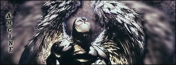
for the spawn things imo nr 4 is the best the other sigs are nice too
text i dont really like it some of your siggs can be good but all the time you destroy it by text
the siggs need some depth
and
1) good colors terrible text in the middle there i think you wanted to make some light but there is no source of light so it looks strange but 4,5/10
2)better then the third one horrible text add something on the stock/render and again no source of light 4/10
3)same as 2 but wihtout bluring it lost some depth
4) 0/10 its really old to use 2 renders in one sigg and it doest look cool (it looks cool but only because of blue color everywhere)
read tutorials is all what i can say
the siggs are still the same and i cant see any evoltion in your siggs
alright, thx. well to improve i need to see my work through your eyes, so i can see what you find lacking in it. so what do you see is wrong with the texts, and how would you have gone about doing it? also, what do you look at to find the depth, and how do you make it? I've seen people say "lighting or blur" but i've tried both and apparently doesnt work, so i need to see what you guys actually see as the "depth". thankstext i dont really like it some of your siggs can be good but all the time you destroy it by text
the siggs need some depth
and
1) good colors terrible text in the middle there i think you wanted to make some light but there is no source of light so it looks strange but 4,5/10
2)better then the third one horrible text add something on the stock/render and again no source of light 4/10
3)same as 2 but wihtout bluring it lost some depth
4) 0/10 its really old to use 2 renders in one sigg and it doest look cool (it looks cool but only because of blue color everywhere)
read tutorials is all what i can say
the siggs are still the same and i cant see any evoltion in your siggs[/b]
ps then the last would be better without the double image? lol. i just thought it looked too empty on that side so i tried to fill it :P
when trying to create depth use the lighting effect in the render section, Try not making it really bright.. But it also depends on the picture..This helps create a focal point in your picture and helps create shadow..and for Text..I can't help you there..cause mine suck too :lol:
about the text: the text should be part of the image it should be easy to read but not the main part of it what happens when you use not simply fonts use fonts like trebuchet and so on and play with colors (lil bit lighter and so on)alright, thx. well to improve i need to see my work through your eyes, so i can see what you find lacking in it. so what do you see is wrong with the texts, and how would you have gone about doing it? also, what do you look at to find the depth, and how do you make it? I've seen people say "lighting or blur" but i've tried both and apparently doesnt work, so i need to see what you guys actually see as the "depth". thanks
ps then the last would be better without the double image? lol. i just thought it looked too empty on that side so i tried to fill it :P[/b]
about depth: the easiest way how to get the depth of the picture is using c4d renders or brush the background dont use only few layers for background sometimes you nd 15+ layers my last sigg (which is posted here) has together 36 layers when you will put c4d use lighten screen multiply and low opacity and over this put gradient map
about light: thats too hard to explain find some tuts but its about putting the light sources and so on.....
here you can find a lot http://www.tutorio.com/ and also a good site http://www.greycobra.com/tutorials/browse/...hop/page-1.html
if you nd something more just pm me here or i can give you msn if you would like to but im also noob
I don't get those sigs, u just download a random picture from google, then write "EEHHHPAAWHHA JOOOJHAALLL" on it, still nICE !!
huh :huh:
huh :huh:[/b]
u know what i mean, all u do is writing ur name, then u just take a picture from google or w/e
lol so you're accusing me of plagiarizing my work? :huh:
 Posting Permissions


 Reply With Quote

Bookmarks