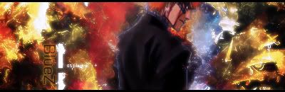
there it is, just a quicky

This is a discussion on Sig For BlueZ within the Graphics forums, part of the Off Topic category; there it is, just a quicky...
Page: 1
 LinkBack URL
 About LinkBacks
there it is, just a quicky
nice colours
yea, i mixed alot of stuff xD
to much perhaps :P
took me like 15 sec to realize where the render is xD
I like that color mix, 8/10
rofl - same heretook me like 15 sec to realize where the render is xD[/b]
Lol :lol: same hererofl - same here[/b]
Anyways, not bad. I'd still add some black in the corners
8.5/10
=o nice u surprised me x) zuahah thats was what u talking about =o interesting x) <3. love ya
when will be my sign over?
Nice,, mixxed TOO much i think.. =) not that im an expert but.. any opinion helps?
and NecrosS.. like ur assassins creed sig? u played that? get it few days ago, its the shit
nah didnt played yet but wanna ý ýs am poor atm no cash for the game and btw ure back to making sigs?
nice but cant really see text.
colors are bad..I'm sorrynice coloursfx are decent except for the golden glow :P The main reason I don't like the colours is because they're just random.. They make no sense and make it look like a messy blob. Keep crankin' em out though!
 Posting Permissions


 Reply With Quote
Bookmarks