my best so far I guess

This is a discussion on On your mind within the Graphics forums, part of the Off Topic category; my best so far I guess...
Page: 1
 LinkBack URL
 About LinkBacks
my best so far I guess
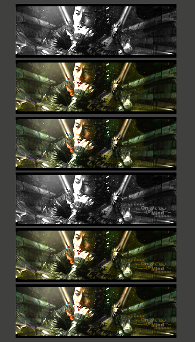
You need to work on colours..even in the b/w version it doesn't look rightmaybe up the contrast a bit.
asdadadsasadsdas lol
only thing I thought that looks good on sig were colors,and I was said that too lol
bringing up contrast would make this sig hurt my eyes IMO
was this version any better?
this is the old one,oversharpened one,new ones had a extra warming filter ^^
btw it's monochrome,and I think Im gonna use just BW gradient map over it now,looks better imo
colours need to be more vibrant and defined..if u dont' wanna change contrast then mess with the saturation..right now he kinda looks like he's underwater :P
x_O how the hell can he look like he's underwater :lol: :lol: :lol:
ok,I'll mess around with it later,even I've alredy adjusted saturation,colors and other things,adjustment layers...
thx for fb
The lighting..See how to the right of his face (left for us) it's kinda hazylike and no details? That part particularly looks like he's underwater.x_O how the hell can he look like he's underwater :lol: :lol: :lol:
ok,I'll mess around with it later,even I've alredy adjusted saturation,colors and other things,adjustment layers...
thx for fb[/b]
asdfafasfa it's coz I didnt use normal soft white brush,I brushed layer above and put it on overlay :lol:
I actually like how that turned out")
 Posting Permissions

 Reply With Quote


Bookmarks