It's been awhileh34r:

This is a discussion on COLLECT YOUR PIECES within the Graphics forums, part of the Off Topic category; It's been awhile h34r:...
Page: 1
 LinkBack URL
 About LinkBacks
It's been awhile
I comment the best I can on others work :/

I like it overall.
Does it say Tipsy? Well its kinda dark. Lack of border.
Anyways, pretty nice. 9/10
borders suck! :P and Yeah tipsy is my medalofhonor/gfx forum name.I like it overall.
Does it say Tipsy? Well its kinda dark. Lack of border.
Anyways, pretty nice. 9/10
Pretty decent Really good!
lol i logged in to comment just because i appreciate ur comments =p.
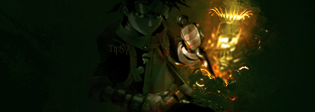
the depth is kinda confusing since its difficult to judge whether the light is behind or in front of naruto, i'm assuming the bg is abstract simply because i cant really tell what it is. i like the use of color and other for the confusing factor involved the depth is not bad. so yeah thats about all i've got. nice siggy overall.
Thx for comment
first of all r u using LCD? coz I don't see a shit except that light behind and his hand :blink:
I know render is suposed to be standing in dark but is it suposed to look like this? (lol,u'll see it normally I supose
but I don't see anything except hand and the light behind xD)
well anyway,after checking with +40% brightness on my monitor lol:
except I don't like anime sigs,it's alright siggy
I like to see more abstract and human render tags from you
as alredy said depth is meh,hand colors are confusing try fixing them first then sharpen
hand and blur the light behind
overall colors could be better,play around with adjustments
nice tag overall,but make non anime sigs more often plxI like ur smudge
Yap thats true lol... on LCD it looks kinda nice.. Only the light could be a little bit bigger.. So the character would be more visiblefirst of all r u using LCD? coz I don't see a shit except that light behind and his hand :blink:
I know render is suposed to be standing in dark but is it suposed to look like this? (lol,u'll see it normally I supose
but I don't see anything except hand and the light behind xD)
well anyway,after checking with +40% brightness on my monitor lol:
except I don't like anime sigs,it's alright siggy
I like to see more abstract and human render tags from you
as alredy said depth is meh,hand colors are confusing try fixing them first then sharpen
hand and blur the light behind
overall colors could be better,play around with adjustments
nice tag overall,but make non anime sigs more often plx
I hate that -.-
made a siggy on my monitor, CRT,and when I saw it on LCD in my school
I was like wtf,this is not what I made....
sig was totally different, there were white splats over it,sig seemed much more
lightened,parts that shouldnt be visible were visible,so it wasn't a sig I was going for -.-
that's kinda lame -.-
sry for offtopic lmao
this used to happen before my new monitorI hate that -.-
made a siggy on my monitor, CRT,and when I saw it on LCD in my school
I was like wtf,this is not what I made....
sig was totally different, there were white splats over it,sig seemed much more
lightened,parts that shouldnt be visible were visible,so it wasn't a sig I was going for -.-
that's kinda lame -.-
sry for offtopic lmao[/b]
 Posting Permissions

 Reply With Quote


Bookmarks