.
.
.
.
Smaller version:
.

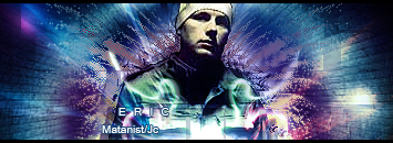
This is a discussion on Erick Prydz, check out my new sig, rate it and give me comments please! I want to improve within the Graphics forums, part of the Off Topic category; .
.
.
.
Smaller version:
....
Page: 1
 LinkBack URL
 About LinkBacks
.
.
.
.
Smaller version:
.
6/10 i dont like and Eric Prydz?? sux

That sig is pretty amazing tbh, I loved it. I liked the colors you chose and the text placement.
GJ, bro
10/10
This is the new version added, thanks canz
Axarus why u didnt like it, i want comments man
I suggested colors and text placement to him :lol:That sig is pretty amazing tbh, I loved it. I liked the colors you chose and the text placement.
GJ, bro
10/10
is it just me, or dosent it look wayyyyyyyy to saturated? or what ever its called XD
+1is it just me, or dosent it look wayyyyyyyy to saturated? or what ever its called XD[/b]
Didnt know you was still alive, but then again i h avent been around for a while.I suggested colors and text placement to him :lol:[/b]
i like it, text placement is good
Yes sorry i should have said this, Thanks to crux he suggested me the text placement and to change the color cuz it was green before of it. Also thanks to ladytorr for giving me ideas too
What do u guys mean by too saturated?
Also thanks for the c&c guys
I love it, good job
 Posting Permissions


 Reply With Quote

Bookmarks