first in a long while.

This is a discussion on HOT SMUDGE SUNDAE within the Graphics forums, part of the Off Topic category; first in a long while....
Page: 1
 LinkBack URL
 About LinkBacks
first in a long while.

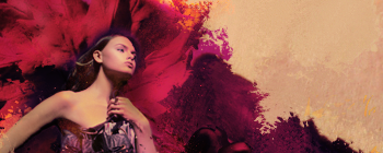
well kind of like it
lol.well kind of like it[/b]
woah. sex pls man,this sig is hot
great smudge,nice colors (not too good but good enough) and nice depth in there (depends
how ur looking at it lol,some ppl wont see it like depth maybe lawl)
experience teached me that a good text in right place increases sig's rate and quality,maybe u dont
like text but I would put a nice one on the right,many fonts fit to this kind of a sig
which fgfx forums u hang on btw?
don't mind 1loveuuuu's comment,every1 have his own taste,but many ppl here haven't seen
more then KO sigs :P
btw,that left arm of her (our left) seems kinda unrealistic,should be blended more I guess...
Why do you still have GLOURIOUS' avatar?
As I stated in the other topic. It's not GLORIOUS' avatar. It is an avatar from an ActOneArt pack that was released to AO members. I frequent www.actoneart.com and www.depth-flux.com archdevil.Why do you still have GLOURIOUS' avatar?[/b]
I think it would look better if :
1) The height was smaller
2)*It*had*a*border
3) It had text
Try em out and gimme a result ^^
meh border wouldn't fit coz of the size....
I'll try some text later.
It does fits if its a 5-7 pixel border in the upper and lower part, not in the sidesmeh border wouldn't fit coz of the size....[/b]
I assumed u thought about that kind of border,but it really wouldn't fit coz of the height of the sig,none
border would,just my opinion,maybe u would like it more with borders
sry for offtopic :P
nice, i really like it.
first in a long while.[/b]
but yeah a good text might be for the better
I don't do borders. Also this sig would look horrible with a border because of the tan.I assumed u thought about that kind of border,but it really wouldn't fit coz of the height of the sig,none
border would,just my opinion,maybe u would like it more with borders
sry for offtopic :P[/b]
my bad I didnt quote,I was talking to RiseAgainst :P
8/10 it would look much better with borders
 Posting Permissions

 Reply With Quote


Bookmarks