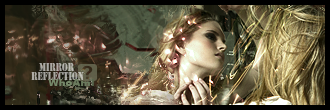
v.2
not satisfied with the outcome,first sig in a week,no inspiration=no ideas=crap sigs
Im desperate

This is a discussion on MirrorReflection within the Graphics forums, part of the Off Topic category; v.2
not satisfied with the outcome,first sig in a week,no inspiration=no ideas=crap sigs
Im desperate...
Page: 1
 LinkBack URL
 About LinkBacks
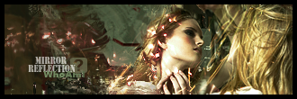
v.2
not satisfied with the outcome,first sig in a week,no inspiration=no ideas=crap sigs
Im desperate
Has potential with better colours and different text. I like the effects on her. Don't like the hair on the right or the border. Don't over gradient your sigs.
text was the only thing I liked about it :lol:
hair,well that's the stock didn't want to mess about it too much not to make it to messy
and about Gmap,there is one,set to multiply and 80% I guess,but it's not too much coz I used
light colors not dark ones,those ur thinking of are adjustment layers I supose ^^
thx for fb,any more suggestions? :unsure:
i kinda like it tho
7/10 ^^

nice sig
both looks same :lol:
both looks same :lol:[/b]
no they doesnt -.-
10/10 from me. i think it is brilliant lol. really nice. good job man. i like all of it .
I can't really tell the difference between them but they're both nice :P 8,5/10
Nice! I like it. 9.5/10
Sig would look better with only the face on it... Those hairs are spookyh34r:
:lol: :lol: :lol:Sig would look better with only the face on it... Those hairs are spooky
thx for comments guys,didnt even see some1 bumped this topic")
about difference-color is the difference...there are some adjustment layers on 2nd which
I 4got to put on the first one... photo filters mostly
Hot girl.
Hot sig.
 Posting Permissions

 Reply With Quote

Bookmarks