Well i was bored while maitenance was happening so i decided to make some sig's which one do you guys think is best?
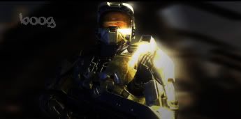
1)
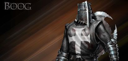
2)
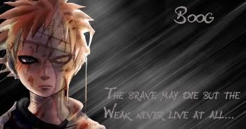
3)
Which one do you like best? and if you want rate them outta 10 :P

This is a discussion on Which ones best? within the Graphics forums, part of the Off Topic category; Well i was bored while maitenance was happening so i decided to make some sig's which one do you guys ...
Page: 1
 LinkBack URL
 About LinkBacks
Well i was bored while maitenance was happening so i decided to make some sig's which one do you guys think is best?
1)
2)
3)
Which one do you like best? and if you want rate them outta 10 :P
#3 is the best blends in well.
lies, she just likes it cos shes emo#3 is the best blends in well.[/b]
I would say #3 is the better of them. Number 1 is just a backround, with a stock and then a layer with the opacancy turned down. and #2 doesn't even have any blending and the colours don't even match.
Yeah, i wanna make #3 smaller tho imma have to change it :lol:
And thanks for your comments ^_^
i think 3 as well, since 2 just looks like an image on a gradient, and in 1 you almost cant see the image :P . though to be honest i dont think 3 is too good either. read some tutorials :P
Yeah made new one imma use it
its also in my sig :P
1 that show is BA
BA?
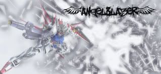
i got 1 more also that i just put together and i decided to screw the stripey background's
i dunno borders are new to me :P
border isnt big enought if you ask me , try to get atleast a 60px border or it look shitty :/BA?
i got 1 more also that i just put together and i decided to screw the stripey background's
i dunno borders are new to me :P
[/b]
lol play nice :P . the gundam sig has the same problem as your other one, too much blending. its good that the stock fits well into the background to make a picture, but you must remember the background is a background, so the focus should be on the stock. it blends too much, to the point it can hardly be recognized. the way you do blending is by brushing over everything (play with different colors, lightings, and blend modes and opacities) and by adding photo filters and gradient maps (both are to blend the colors, you can make it blend without losing detail and clarity).border isnt big enought if you ask me , try to get atleast a 60px border or it look shitty :/[/b]
Oke AningmE hows this one? took me a while to do it i had lots of help fro ma Tut i found
Font sucks the dank.
Well you get me a font :P i cant find any good ones
You were sposed to make me one...but nice job on #3
 Posting Permissions


 Reply With Quote
Bookmarks