
This is a discussion on rate within the Graphics forums, part of the Off Topic category; ...
Page: 1
 LinkBack URL
 About LinkBacks
thats some deep shit.
8/10
4/10
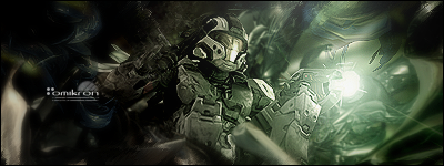
its ok. very generic. looks like a halo render pasted over a blurred c4d render with a radial glow/softbrush.
looks pretty cool to me. but im noob with PS so..i wouldnt know what it takes for that
anyway gj
seriously..
x/10 is retarded...
8/10 would mean this is better than 80% of every sig ever made..
no
The focal point is brought to the big ass ball of light.. not the stupid halo stock
render + stock + blue =/= good sig
Kinda nice But i agreeThe Focus is on the light..
Btw why is ARTdivision down?
Kinda nice But i agree
Btw why is ARTdivision down?
the host is transferring it to a brand new serveri hope it will be a lot faster
 Posting Permissions

 Reply With Quote

Bookmarks