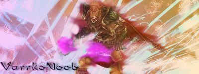
Experimenting some stuff, this came out in the end

This is a discussion on Rate me within the Graphics forums, part of the Off Topic category; Experimenting some stuff, this came out in the end...
Page: 1
 LinkBack URL
 About LinkBacks
Experimenting some stuff, this came out in the end
8/10
too much blur at left arm
not bad, i think the background is pretty cool. the colors arent blended too well, theres no lighting or depth, and the red smudges behind the char look a bit odd, but otherwise its pretty good
render and background colors don't match , no depth , hate the font
work on that bro
ty
i'll be working on these ^^
just something missin
trust me best text is normal windows text, like arial n shit, keep text simple
also most sigs need border to be good. ur need one
u need better colors, sharper render, its blured and color is removed from it...
and bg could be good if u fix it but it doesnt blend / flow with render, i dunno how to expres, it isnt same theme... ehh u know what i think
 Posting Permissions


 Reply With Quote

Bookmarks