Just need your opinion cuz im tryring new tuts.
Old:
New:

This is a discussion on Which "Volcompat" sig is better? *Updated* within the Graphics forums, part of the Off Topic category; Just need your opinion cuz im tryring new tuts.
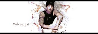
Old:
New:...
Page: 1
 LinkBack URL
 About LinkBacks
Just need your opinion cuz im tryring new tuts.
Old:
New:
new one for sure
new one fer sure
the thirth one
New, but they're all still pretty basic. If you wanna get some wicked tutorials and get some proper feedback on your work, try looking around on the gfxvoid.com forums. Deviant art got some alright tutorials to check out. Try learning more about smudging, different brushes, clipping masks, adjustments layers (I noticed you used one in the new black signature, but instead of using one gradient map, on 20-30% opacity, try using 2-3 different gradient maps / filters with different layer options for example hard light, multiply, overlay, color dodge), try out all the functions in 'Adjustment layers' to see what sorta effects you like, try out displacement maps in 'distort' and also 'ripple' etc on colour dodge etc). I don't like your borders either and for artsy / effect signatures i think it looks better with no border, but the ones you've got for the current signatures are okay i guess. :P
P.S. Text tutorials can be helpful, but text can be plain hard to get right sometimes.
Lawl.the thirth one[/b]
Don't really like any of the sigs, could be much better.
Zealous: Your GoW sig is fucking rapage, nice one.
 Posting Permissions


 Reply With Quote
Bookmarks